So in the proposal phase this is what we see
Using the image as a reference^^
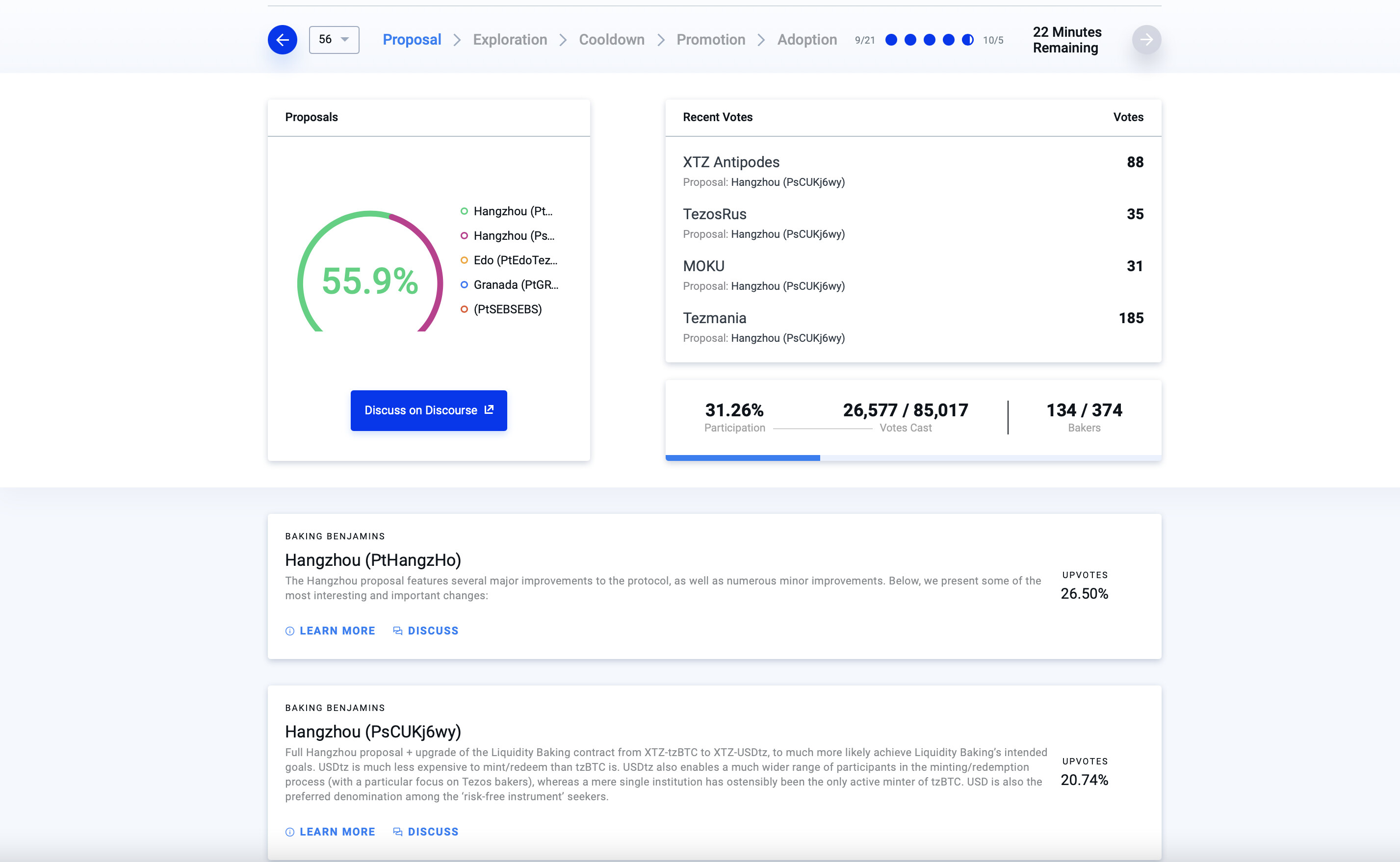
Regarding the chart in the top left corner, this the chart that would be better for measuring if a certain threshold has been achieved, not for competing proposals.
There’s something about the dominant proposal being green that’s self-reinforcing. Like it passed already. I feel like this was an old chart that was originally thought of to use for the promotion phase, but then rejected and made its way here.
Plenty of better chart options out there.
You also can’t tell anything about the other proposals, percentages…
There’s nothing to break them down any further. No vote count, let alone further diagnostics.
For top right corner, we can’t see the votes past the most recent 4. Historical views or pagination would be better for full context.